Planning
John Parker owns a business which specs, designs and fabricates performance parts for vintage cars. He does everything from full race cars to minor performance upgrades for stock vehicles. He specializes mainly in Volvos but has recently started selling products for other European makes like MG, Alfa and Triumph. He approached me some time ago about a redesign of his website after seeing automotive related work I'd done elsewhere and I thought the work was a good fit. I am one of John's customers so I have a good understanding of his products and audience and am conveniently open to barter.
I used this as the subject of an IA course assignment at UT School of Information. My typical work is usually less boutique and very revenue driven. This was a great opportunity to focus on broad details of a small specialty site rather than focused details of large business projects I typicaly work on. I enjoyed the process.
John's existing design was created by our friend Phil Singher of Vclassics.com. This site was very competent from a content, design and construction perpective but it was beginning to feel outdated after many years since the initial buildout. John's real frustration with his website was his inability to edit it. It was made up of static html files and altering these was a time consuming chore and beyond his technical ability. Over time the site developed issues in response to this problem. New sections were started rather than altering existing sections, related content was dispersed across the site, pricing was difficult to find and the results were lots of emails and calls from customers asking for information which should have been easily found on the site.
Existing Site
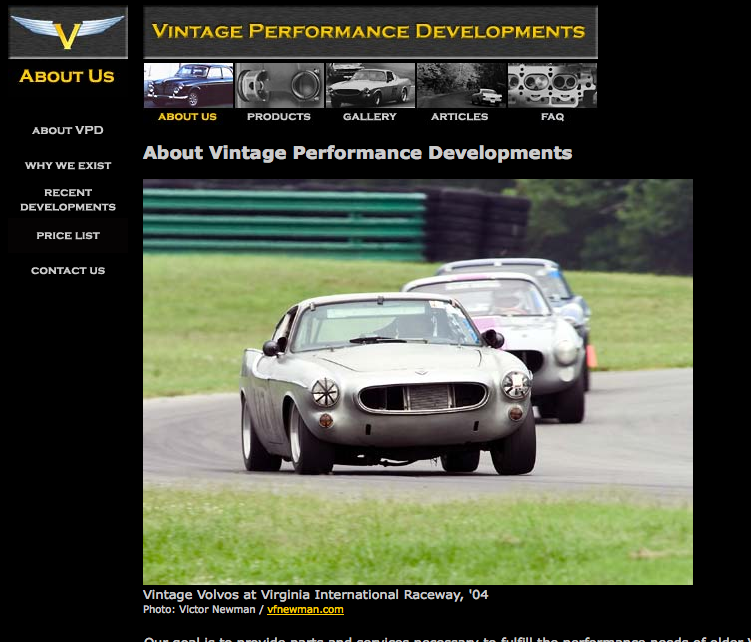
Due to its age the original site used frames, has a splash page, no css, images for nav and many other now-outdated techniques which were en vogue at the time. This all needed to be brought up to date. It was decided that we would stick to the original design for colors and logos rather than hire a designer.
I told John that his site was going to be an assignment for a course at the UT school of Information and that there was a deliverable timeframe for this course. We had been discussing this site for a while and this helped put some stakes in the ground for finally getting it done. I agreed I would do my best to work with his existing content to create the new customer-facing site but CMS (Content Management Software) tools for editing his content could be delayed.
Analysis
I analyzed John's goals and things I saw as priorities and came up with a rough set of criteria for the new site.
User Profiles
As part of the planning process I tried to identify some profiles of John's customers. I created the following profiles and their probable needs and behaviors:
- Core Customers: The customers which he would most like to acquire and maintain. These are people who engage John in extended projects such as full driveline builds or complete race car design and construction. These people make up the core of John's business. He wants to engage these people with email communication and keep them informed regarding recent product research and new parts.
- Retail Customers: John has a number of products that are not available from other, more retail-oriented sources. These include suspension packages , driveline parts, and internal motor components designed from scratch or repackaged from various sources. These customers typically want prompt service and shipping and can sometimes pose a problem for John with fulfillment since he is a 1-man shop. He does not want to turn these customers off but he does want to better communicate everything he can about available retail products so he can spend less time answering questions about them. He would also like to communicate that the leadtime on some of these products may take some weeks, deemphasizing the idea of retail and any expectations of click-and-ship immediate gratification.
- Potential Customers: John writes articles and provides photo content that will draw in people interested in vintage racing and Volvo performance. He is considered to be an expert on these topics. People may navigate to his site while browsing for general information and then decide to engage as core or retail customers.
- Peers: John has a lot of relationships with other racers and performance Volvo experts. He would like to have a recent developments functionality that helps him communicate with these people his standings or any new research he is doing.
- Non-Volvo retail customers: This is a new category of customer for John. He has created a few very compelling universal products which are not available from other sources and he also has some distribution for European products with high margins that he would like to take advantage of. This sort of customer is segmented off because they need to be accommodated in what is otherwise a very Volvo-specific site and set of product offerings.
High Level Goals
The following is my rough draft of what things we would try to accomplish with the redesign:
Usability
- Navigation: refactor navigation to a fixed set of labels. Use javascript to hide subnavs.
- Titles: old site had uniform page titles. Bad for search results, accessibility and bookmarking.
- Search: Old site lacked a search function.
Content/Feature Changes
- Recent Developments: Add some kind of freshness with blog-like content that will keep users coming back.
- Improve look and feel of catalog: Merge and streamline content. Add images, videos, links - anything possible to make the site awesome.
- Avoid Creating a feeling of retail: Very little of John's product is off-the-shelf. Products take lead-time and this needs to be expressed as clearly as possible to customers to avoid frustration.
- Get rid of any 'coming soon' feeling of the site: The old site had a lot of partially finished sections. Lets remove them or populate them.
- Customer Acquisition: Encourage people to add their names to John's email list. He can use this to draw people back when he has decent content updates.
- Feature Items: Allow John to feature items to draw people into product sections.
- Dump Splash Page: gone the way of the dodo...
Update Technology:
- Get rid of Frames: They are terrible for Search Engine Optimization and web crawlers. Visitors from search engines were linking to inside panels of his site and all nav was stripped away.
- CSS: in place of the old school table and FONT tag code
- Choose Text over Images: Try to make the nav as friendly to search engines and accesibility standards as possible.
- Dynamic pages and header and rendering of common components, explore possibility of CMS functions.
Next, create a Dictionary and Labels
Consistency in labeling items is important. Consistency within navigation and site for customers, consistency with other similar sites customers may frequent and even consistency within the CSS, html and backend entity representations. I've learned from experience that it is beneficial if developers, sysadmins, designers, copywriters, execs and marketing people all refer to the same labels for things and it should be easy enough to do at this level.
Properly named labels can make the difference between a user finding what they need quickly or understand what content you have at-a-glance. In class we worked in groups and did some card sorting exercises to determine what labels would be best for our sites. I began with my seed list which I generated by using John's existing labels, exploring comparable sites and brainstorming on my own. As part of this exercise I actually had to create John's product taxonomy which I took from his existing pricelist.
Initial Stab at Label Dictionary
| Navigation Labels | Product Taxonomy | Code |
|---|---|---|
    Home
    Products
    Services
    Recent Developments  (News?)
    Articles
    Gallery
    Contact
    About Us (History? Company Info?)
|
Engine Driveline Suspension Air/Fuel Delivery (Carburetion?) Exhaust Valvetrain Ignition |
left_side middle_wide middle_narrow content_block title display_order type subtype nav subnav |
These values eventually mutated greatly but this was my first pass.
Unfortunately the access-logs for his server were incorrectly configured and search log analysis was not available for fodder to create labels. I generated a dictionary of possible terms based on the language of the existing site, language used in similar sites and my buest guesses to use in navigation and headers around the site.
I did, however, run his site through a small content analyzer I built in Perl. Just to see what words showed up most often in his existing content. It's not sophisticated enough to account for noise words but it is worth a look if for not other reason than I took the time to do it.
The Hard Part
All through planning and design I had this nagging dread regarding the admin screens: John wants to administer his own content in a way that makes sense to him and I cannot expect him to learn html. John is, by definition, a capable technologist - former army test engineer, attorney, race car builder, writer and exceptional driver; but John is a 4 out of 10 in terms of internet literacy and unlikely to commit time to ramp up on these skills. He barely has time to run his business and just wants something that works.
So these are constraints! I am building a customer facing site geared towards a general internet audience which is easy enough; it is all read-only, right? Creating tools for someone who is not used to generating content on the internet and all of the quirks and metaphors that come with it - this is a challenge. Programmers often assume too high a level of literacy from users and this is a good time to focus on that issue. Off we go...
Design
Home Page / Nav Sketch
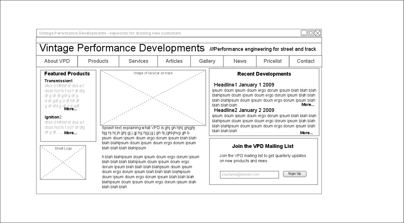
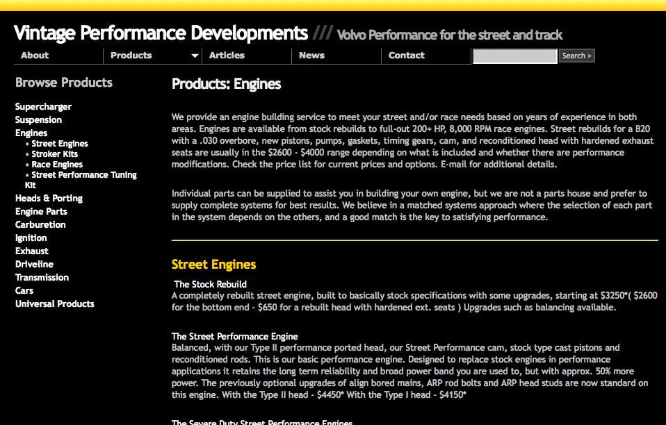
To the right is my first sketch of the navigation and homepage layout. My goals here are to give an at-a-glance understanding of the site, show and convey fresh content and draw the user deeper. In this diagram I failed to include search and it follows early nav but otherwise it is a pretty faithful representation of the final product.
This activity helps a lot in starting to identify content that will need to be generated to make this work. I think the 'recent developments' portion works nicely and John could use it to build brief updates on products. The left section devoted tp featured products could be useful for trying to expose the "universal" (non volvo) products he is moving towards. The bottom of the page, stuff beneath the fold, could be used to expose more content - particularly thinking gallery content or article teasers. I've seen a lot of sites recently which expose the nav and subnav in the footer since the space is unsused, this may be good for accessibility and search engines.
SiteMap
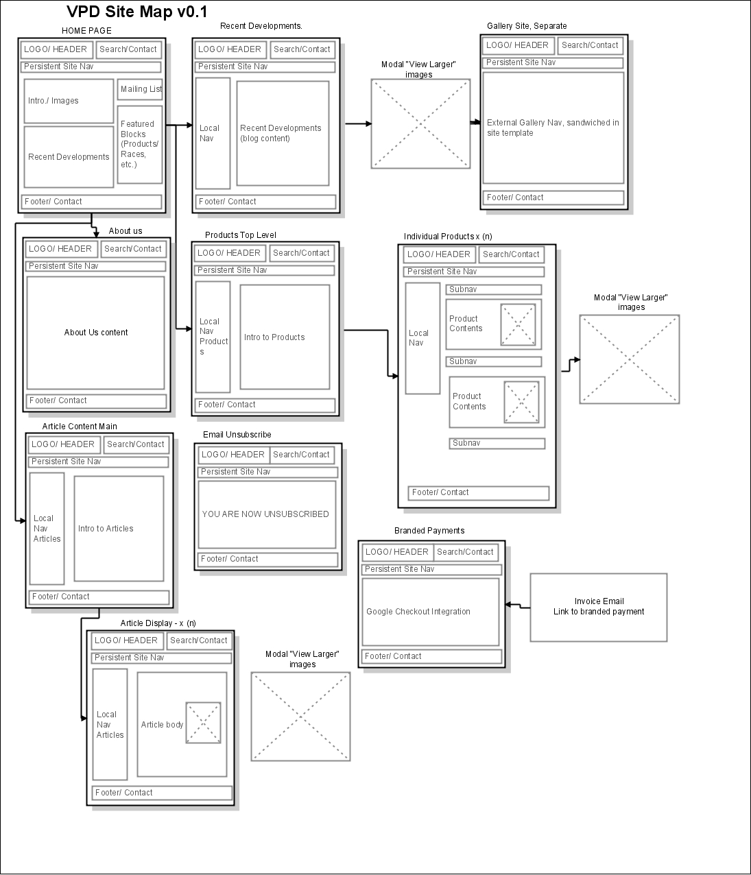
I started with a sketch mapping the site out. I use a great little tool called Gliffy for stuff like this. It is "just right", in a goldielocks comparison of diagraming tools and free for limited use.
At this point I started reorganizing my basic structure as I saw more of the blanks filled in and considered how things might best fit together. I began thinking more in terms of entities and my backend organization as the screens unfolded. The navigation collapsed to a narrower field during a survey of what content was actually available. For example "services" made more sense as something which was interwoven with products. Products and Articles became sub-sites in terms of navigation, presenting up to 3 layers of hierarchy.
Galleries as a stalone piece of content made less and less sense the more I thought about it. I think galleries are clumsy when presented in a vacuuum and usually work best when coupled with some larger body of text which helps set up the context and captions for the gallery. At this point I sketched any gallery functionality as being subordinate content to other sections.
Here I started thinking about the email sign up functionality I had spec'd out. I added pages for email unsubscribe and sketched out a thought where users could pay branded paypal invoices if John was interested in that sort of thing.
One thing that is glaringly missing from this site map is the equally complicated screens used for administration of the content. These screens prove to be an IA challenge all their own.
CMS Interview process
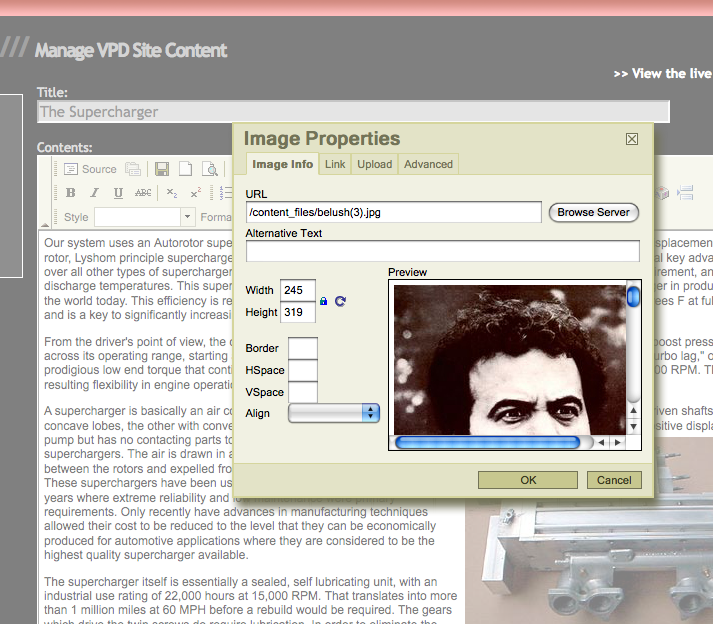
Again with the elephant in the room. How do I let John edit this stuff? To figure this out I defined my constraints and embarked on a 15 hour interview process with all of the modern CMS systems. This task in and of itself was useful for me in a greater context. I had not reviewed the state of the CMS landscape lately, most recently choosing Krang as the basis for a newsroom CMS. This is a big part of my technical background and one thing I've learned over time is that there are no magic bullets - highly functional CMS' are usually specific to a task and will impose a lot of constraints in terms of design layout and content metaphor. However, any generic CMS is usually so abstracted and multi-purpose (and powerful) that users need training and commitment to navigate and use it. A good CMS would allow John to edit his content in a way that mimicked a word processor and "Do the Right Thing" when it came to managing uploading and including images.
Wordpress:
Man, this thing is nice nowadays. I've been using it for my blog and I really love it. It's designed for blogging and it does everything right - bloggers can focus on their content and leave the rest to Wordpress and maybe a competent designer to customize. This would be perfect for John! I've been working with php a bit lately so I thought I could crack open Wordpress and its world of open source plugins and crank out a decent cms for the VPD site. 3 hours in- nope. The process involves so much subtraction of specific functionality to make it fit John's needs. In removing or short-circuiting all of the blog features the end result would be unmaintainable franken-code. It's like taking a purpose-built racecar designed for left-turn tracks and trying to retrofit it for generic short trip commuter duty with an automatic transmission and A/C... this was the case for any blog-centric CMS I looked at.Drupal:
Also an amazing system. Workflow, user authentication, community, millions of plugins. So much stuff that I don't need, same issue as wordpress for this particular problem. I also installed and test-drove Joomla, ModX and a few others. All seemed too complicated for this task and the audience. I need something on rails that makes this as easy as possible for John. I was starting to lean heavily towards custom development of a CMS but I refused in 2009 to accept that there is no off-the-shelf toolset that can make this work.Concrete5:
Getting warmer! This one allows someone who is logged in to just click and start editing the site. Couldn't get much easier than this, nice tools with users like John in mind. I install this one and play with it for several hours, their design patterns are understandable and clean - this is something I could fork and make work... but it wasn't perfect, still not flexible enough. I'd been burned too many times at this point and the thought of commitment was tough. Not using their tool was my problem, not theirs.Inline WYSIWYG
Inline html editors take over textarea and make them look like familiar wordprocessing programs. The good ones are the basic building blocks of the larger CMS systems. As soon as I started playing with these I felt like I found the level of outsourcing I wanted - I just needed to solve the uploaded image problem. Ideally John could upload an image from his camera and the software on the server would process it and "Do the right thing". I experimented with TinyMCS,FckEditor and a couple of others. At the end of the day the FckEditor design won me over - their image upload manager was just about right in terms of user interface and library management. I went behind the scenes and added some intelligent image resizing functionality to the tool and was satisfied. Getting warmer! This one allows someone who is logged in to just click and start editing the site. Couldn't get much easier than this, nice tools with users like John in mind.Construction
I'm not a designer
I borrowed some basic css from my friend Rik Catlow, artist and designer, as a starting point. Thanks Rick! I'm not totally clueless - I've been fluent in html and css for a very long time and I have a history of design and visual art but I'm typically over-reliant on designers for helping with these things. Not having a designer available for this project was a great thing for me, in the end. I got to flex some braincells and do some smart cascading designs and tighten up skills which had lately gone flabby.
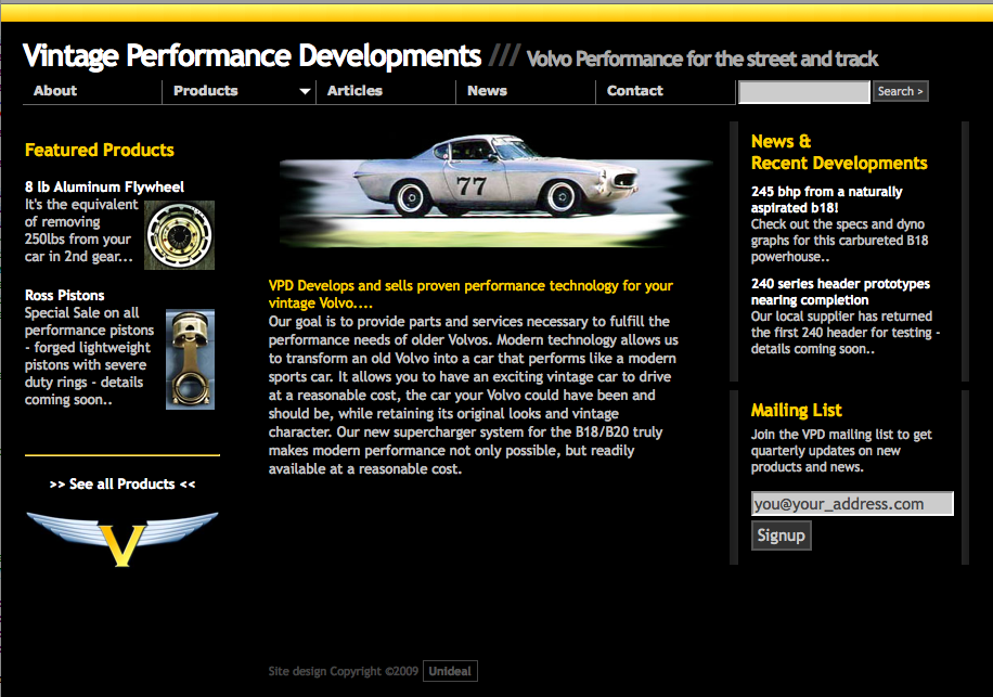
Prototype Homepage Screenshot
Prototype Product Page Screenshot
Frameworks, languages
Bypassing CMS systems I've commited to creating this functionality myself.
I've been a LAMP programmer for a while. I chose to use a linux based host machine I already had to do the development. I created a virtual host on the server and created a subdomain vp.unideal.net for development purposes. I can write php but my best language is still Perl5 so I had the server answer any .php files using mod_php and mod_perl with HTML::Mason parses any .html extensions. This allows me to interweave any php based helpers, like the fckeditor image management suite, while still developing in perl. HTML::Mason is an excellent tool for this kind of work. The concept of autohandlers and dhanlders for abstracing page templates has an inheritance structure similar to cascading style sheets and is infinitely flexible. I've found few template frameworks that hit the sweetspot quite as well as Mason.
I used some sturdy, recycled, handbuilt perl libraries to abstract ORM functions for the databse. I'm pretty sure I actually wrote more javascript and php for this project than perl. Good for Perl!
I selected JQuery for use in all slick user interface function. Their UI libraries are used extensively along with some special plugins, most notably jqueryslidemenu which is totally awesome for drawing navigation and will get further use from me.
Entity Design
Since the scope of this site is limited I wanted to create the most straightforward schema possible and try to adapt it. The core object of this site is my ContentObject entity which is stored in a mysql database.
content_block ===================================
           id: 101
       c_time: 2009-05-03 13:09:36
       m_time: 2009-05-03 13:09:36
        title: Steve Berry's Supercharged 1971 1800E
      content: <p>Steve Berry has been working on this car for 6 years.... </p>
         type: article
      subtype: customer_cars
display_order: 1
        price: NULL
   subcontent: NULL
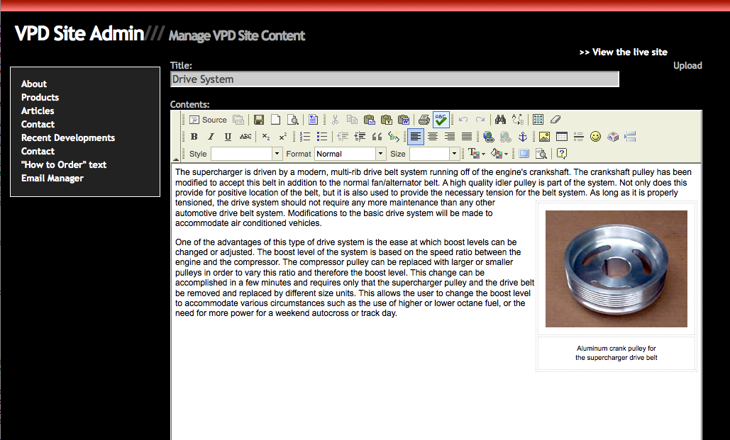
Software and automotive stuff have a lot of things in common: "Keep it simple, stupid". I use the type and subtype fields of the record to differentiate where the record goes. If I am rendering the 'about' page I ask for "type=about, subtype=index". To render a list of product subtype I select "type=product,subtype=engine,order by display_order". The content field is of type text and contains whatever html is submitted by the fckEditor. This all just works and means I can designate any piece of the site as 'editable', much inline with the concrete5 design ethic, and use a single set of forms to manage it. I use some text config files to store certain structures like the high level product taxonomy and the basic categories for articles which are all pretty flexible. This worked out really well and I recommend this pattern to anyone who has a project of this scope. I literally have 2 tables driving the whole thing. It extends well but once I apply more metadata to this it could get out of hand... "perfect is the enemy of good": I call it a schema and move on.
Search
I was able to use regained space in the nav bar to add a searchbox which I had overlooked earlier. For now I am using google's ajax API to load search results. I'm not totally satisfied with this method and may instead use the api for fetching data and display it myself. I definitely will not be trying to build any locall full text searching, the project just doesn't call for it - that sort of scope creep is best used elsewhere.
Analytics
Also relying on google here with their excellent free analytics. They recently opened a data API to this service so I expect I'll be able to give John some kind of widget to see page views, visitors and search analysis.
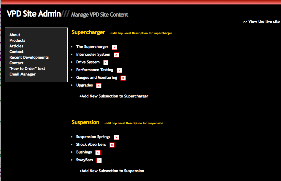
Admin Screens
These ended up being completely custom. I created an admin navigation which mirrors the editable portions of the site and use draggable sorting and ajax to make some slick interfaces. FckEditor does most of the heavy lifting.
Admin Product Manager Screenshot
Add/Edit Page Screenshot
Upload Images
Long March
(Queue 1980's video Montage) Lots of Details. From here I used all of these building blocks to flesh out my earlier ideas. I built admin screens and customer-facing screens in tandem, iteratively. My monolithic "Add/Edit" forms for content held up unchanged through most of this and I didn't take many shortcuts. Things like screens to accept and insert requests to be added to email lists, navigation, cross browser issues and an enormous amount of time spent sorting and merging existing content.
Importance of steps 1-3
I'm a coder and a prototyper. When I see a problem my hammer is a source-code repository and everything looks like a nail and this can be a handicap. I can't quantify the value of the amount of planning, analysis and design I did. This was literally academic: BUT my scope was very zeroed in before I started building. This saved me a lot of wandering in my approach to coding. A good programmer is always at risk of misapprehending actual scope or 'premature optimization' in the early phases of a project. These early misguided designs usually create inertia when faced with the actual business rules and have to be unraveled at some cost. Every coder should focus more on these early phases of projects.
Verification
Validators
I ran my site through the W3C validators. The signal-to-noise ratio on these things is high and I wish they would do some more granular relevance tuning but I did catch some bad tags, typos and incorrect nesting. It would take a month to get a fully green light but I did feel like it helped knock out the worst offense.
Users
Unfortunately I wasn't able to do very much human testing before launch. I sent the site to some colleagues and got some great criticism about design inconsistencies. I also had doubts about the readability of my color scheme. Suprisingly two people over 50 told me they preferred white text on black to any color on white. Weird, I need to look for data on this one.
Keith Instone's Navigation Stress Test
"Keith Instone's simple and practical Navigation Stress Test" entails dropping sombody on any page of a given website and asking the 3 following questions:
- Where am I?
- What's here?
- Where can I go from here?
I'm still working on these but I think 2&3 are pretty well managed by the global nav. Local subnav while browsing products and content will help expose substructures to the user and lets them know where they are withing those areas.
Globally "Where am I" is not very well handled. I've experimented with some breadcrumbs but none of them look right with my design. I think I will evenutally use some subtle highlighting of the main nav to give them a sense of what section they are in.
Credibility
I followed the Stanford Guidelines for Web Credibility to assess the site from a credibility standpoint.
- Make it easy to verify the accuracy of the information on your site.
- Show that there's a real organization behind your site.
- Highlight the expertise in your organization and in the content and services you provide.
- Show that honest and trustworthy people stand behind your site.
- Make it easy to contact you.
- Design your site so it looks professional (or is appropriate for your purpose).
- Make your site easy to use -- and useful.
- Update your site's content often (at least show it's been reviewed recently).
- Use restraint with any promotional content (e.g., ads, offers).
- Avoid errors of all types, no matter how small they seem.
I think all of these that can be covered are covered and hopefully the dynamic evaluations will hold out over time.
John Parker
John's likes it and is already stretching the limitations of the tools I made. I thought acquainting him to the CMS section of the site would take a while and maybe some screen capture video tutorials but he seems to get it right away. Update: John took to the editing tools very well and is kicking ass with them.
Maintenance and Future Development
Maintenance
Every night at midnight I rsync the document root and create a dump of the database and sync to a unix box at my house. I commented my code the best I could and used standard packages wherever possible. I think the result is actually a lot more maintainable than if I had hacked any existing CMS systems.
Future Developments
This is a fun project. I like cars a lot so that helps and the end result is very satisfying. We launched the site a little earlier than I was hoping (the day before I went on international vacation) but I'm still doing a lot of trimwork. It always amazes me how long it takes to do something right. Hopefully the majority of ongoing improvements will be content related rather than code or structure.
I really like this site and see a distinct possibility of leveraging the work I've done to power other sites within this same vertical or even port it to other verticals - real estate template site or marketing purposes. Stuff that makes money but is not fun.
Thanks to Phil S/ for an easy existing design to work with and John Parker for fun racecar content to render. Many thanks to Don Turnbull for an excellent Information Architecture course and thanks for input from peers in the class.
steve berry. 06/2009